

Designing of Logo is very important. It represents the company and what the company does. The font, shape, color and images are included in logo design services. We are purely creative and go for such custom logo design which helps Company to create a place for them.
Your logo should be very simple and static. You should use simple colour for designing a logo. It should be flexible to fit on any media; either it may be a business card, document, and letterhead, ads on papers or electronic media. A scalable logo looks outstanding in different sizes and adapts for the application of different colours.
On the first look, the logo should catch the eye of the customer. It should be attractive and easy to remember.We are brilliant and extremely creative freelance Logo Designers in Hyderabad. Additionally, our logo design quality control ensures that only the best concepts created for our clients.
As Logo states the image and integrity of a company, one should asses the business and be creative to interpret the business name in the form of a scalable image. The colours, lettering and the caption should be unique; this way you can create a unique logo for your business.
We specialize in the following services for logo design + branding: Premier logo design, logo redesign, logo elements, logo brand icon, logo correction, multiple logos completing a brand, brand identity, name branding, tagline creation, brand guideline booklet, social media logo branding, apparel branding, color usage, print branding

The Golden ratio is a special number found by dividing a line into two parts so that the longer part divided by the smaller part is also equal to the whole length divided by the longer part. It is often symbolized using phi, after the 21st letter of the Greek alphabet. In an equation form, it looks like this:
a/b = (a+b)/a = 1.6180339887498948420 …
It’s believed that the Golden Ratio has been in use for at least 4,000 years in human art and design, but it may be even longer than that – some people argue that the Ancient Egyptians used the principle to build the pyramids.
In more contemporary times, the Golden Ratio can be observed in music, art, and design all around you. By applying a similar working methodology you can bring the same design sensibilities to your own work.


Effective logo design and branding makes for efficient marketing. A veritable snapshot of your company’s brand, your corporate logo sends a direct and immediate message to your audience, so it is important to convey that message properly. We always up for the challenge, whether it’s revising your existing logo design or creating an entirely new identity.
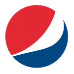
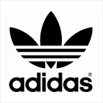
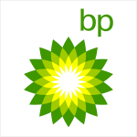
An abstract mark is a specific type of pictorial logo. Instead of being a recognizable image—like an apple or a bird—it’s an abstract geometric form that represents your business. A few famous examples include the BP starburst-y logo, the Pepsi divided circle and the strip-y Adidas flower. Like all logo symbols, abstract marks work really well because they condense your brand into a single image. However, instead of being restricted to a picture of something recognizable, abstract logos allow you to create something truly unique to represent your brand.
The benefit of an abstract mark is that you’re able to convey what your company does symbolically, without relying on the cultural implications of a specific image. Through color and form, you can attribute meaning and cultivate emotion around your brand. (As an example, think about how the Nike swoosh implies movement and freedom).

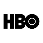


IBM, CNN, HP, HBO… Noticing a pattern, yes? They’re the initialisms of a few famous businesses with rather lengthy names. With 2 or 3 words to remember, they’ve each turned to using their initials for brand-identification purposes. So it makes perfect sense for them to use monograms—sometimes called lettermark logos— to represent their organizations.
A lettermark is a typography-based logo that’s comprised of a few letters, usually a company’s initials. The lettermark is all about simplicity. By utilizing just a few letters lettermark logos are effective at streamlining any company brand if they have a long name. For example, how much easier is it to say—and remember—NASA versus the National Aeronautics and Space Administration?


Similar to a lettermark, a wordmark logo is a font-based logo that focuses on a business’ name alone. Think Visa and Coca-Cola. Wordmark logos work really well when a company has a succinct and distinct name. Google’s logo is a great example of this. The name itself is catchy and memorable so, when combined with strong typography, the logo helps create strong brand recognition.
Also, like with a lettermark logo, typography will be an important decision. Since the focus will be on your name, you’ll want to pick a font—or create a font—that captures the essence of what your business does. For example, fashion labels tend to use clean, elegant fonts that feel high-end, while legal or government agencies almost always stick to traditional, “heavier” text that feels secure.


A pictorial mark (sometimes called a brand marks or logo symbol) is an icon—or graphic-based design. It’s probably the image that comes to mind when you think “logo”: the iconic Apple logo, the Twitter bird, the Target bullseye. Each of these companies’ logos is so emblematic, and each brand so established, that the mark alone is instantly recognizable. A true brand mark is only an image. Because of this, it can be a tricky logo type for new companies, or those without strong brand recognition, to use.
The biggest thing to consider when deciding to go with a pictorial mark is what image to choose. This is something that will stick with your company its entire existence. You need to think about the broader implications of the image you choose: do you want to play on your name (like John Deere does with their dear logo)? Or are you looking to create deeper meaning (think how the Snapchat ghost tells us what the product does)? Or do you want to evoke an emotion (as the World Wildlife foundation does with their stylized image of a panda—an adorable and endangered species)


Often colorful, sometimes cartoonish, and most always fun, the mascot logo is a great way to create your very own brand spokesperson—er, spokes-character(?).
A mascot is simply an illustrated character that represents your company. Think of them as the ambassador for your business. Famous mascots include the Kool-Aid Man, KFC’s Colonel and Planter’s Mr. Peanut. Mascots are great for companies that want to create a wholesome atmosphere by appealing to families and children. Think of all those mascots at sporting events and the great dynamic they create by getting involved with the audience!

It’s in the name! A combination mark is a logo comprised of a combined wordmark or lettermark and a pictorial mark, abstract mark, or mascot. The picture and text can be laid out side-by-side, stacked on top of each other, or integrated together to create an image. Some well known combination mark logos include Doritos, Burger King and Lacoste.
Because a name is associated with the image, a combination mark is a versatile choice, with both the text and icon or mascot working together to reinforce your brand. With a combination mark, people will also begin to associate your name with your pictorial mark or mascot right away! In the future you may be able to rely exclusively on a logo symbol, and not have to always include your name. Also, because the combination of a symbol and text create a distinct image together, these logos are usually easier to trademark than a pictorial mark alone.


An emblem logo consists of font inside a symbol or an icon; think badges, seals and crests. These logos tend to have a traditional appearance about them that can make a striking impact, thus they are often the go-to choice for many schools, organizations or government agencies. The auto industry is also very fond of emblem logos. While they have a classic style, some companies have effectively modernized the traditional emblem look with a logo designs fit for the 21st century (think of Starbucks’ iconic mermaid emblem, or Harley-Davidson’s famous crest).
But because of their lean towards higher detail, and the fact that the name and symbol are rigidly entwined, they can be less versatile than the aforementioned types of logos. An intricate emblem design won’t be easy to replicate across all branding. For business cards, a busy emblem may shrink so small before it becomes too difficult to read. Also, if you plan on embroidering this type of logo on hats or shirts, then you’ll really have to create a design that is on the simple side or it just won’t be possible. So as a rule keep your design uncomplicated and you’ll walk away with a strong, bold look that’ll make you look like the consummate professional.
Negative space is, quite simply, the space that surrounds an object in a image. Just as important as that object itself, negative space helps to define the boundaries of positive space and brings balance to a composition.
More and more these days, the creative world is seeing an emergence of artists creating positive spaces and shapes that, in turn, cleverly carve out shapes in negative space intentionally. And the results can be stunning.


