Source: copied from blog.hubspot.com. For orginial link click here
When a designer first takes on a new logo project, he spends a lot of time trying to understand both the organization and its audience. We’ll get to the process of learning what a logo needs to “say” later, but first, let’s talk about what makes a great logo in the first place.
Most logo designers follow some iteration of these principles of great logo design:
Graphic Designer Tyler Littwin, who creates logos for HubSpot and other organizations, says these five principles are great for keeping designers from going too crazy when designing a new logo.
“Designers have a tendency to get excited about the prospect of designing stuff that looks cool and uses cool, new styles,” Tyler told me. “But when you’re designing a logo, you’re ultimately solving for a problem. You’re trying to convey something simply that gets across the core tenets of an organization and what that organization does. Keeping these five things in mind prevents you from getting carried away with the flash of what you’re doing. It keeps you honest.”
Before we get to the design process, let’s dissect two examples of great logos.
Evernote’s logo is a great example of a logo that follows all five of these principles. It’s an elephant, which is a reference to the well-known saying, “An elephant never forgets.” The elephant’s folded ear cleverly resembles the popular document icon.

Not only is the logo simple, memorable, and appropriate for its audience, its physical and digital attributes work perfectly across different media variations and usages. “There is not one application I have seen where the logo fails to fit perfectly, all the way from the 16px favicon, the browser extension icons in both colour and mono, the iOS icons, Macintosh dock icon, and so on,” writes Graham Smith, a freelance designer of logos and brand identities. Plus, elephants will never go out of style.
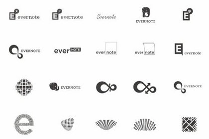
But it took six weeks of concepting to come up with the simple elephant logo. Here are other initial ideas that were produced before the elephant was chosen.

Once the elephant was chosen, it went through another series of iterations before the final design was chosen. The whole process took six weeks, and it’s become one of the most compelling logos today.
On a smaller scale, we have Icon Snowskates, a small snow skateboard company operated by a son and his father in Massachusetts. (Full disclosure: The son in this father-son duo happens to be Matt Plays, who also works on video and design projects at HubSpot.) Seven years ago, he set out to create a logo for his young company that had to look good on a website, but that could also work when stretched across a 33-inch, snowboard-like base.
“I was inspired by brands like Element Skateboards and Plan B Skateboards whose logos are geometric and fare well on boards and on the web,” Matt told me. “I chose to use a tightly tracked Century Gothic for the type, and paired it with a slightly abstract, inverse water droplet logo mark.” Here’s the iteration that appears on the website:
Why the water droplet? “While rain and other precipitation usually means bad news for snowboarding, that’s not the case for snow-skateboarding,” says Matt. In other words, the water droplet is exactly what differentiates his snow-skateboarding company from snowboarding companies that have a similar vibe and audience.
Plus, the tightly tracked type and geometric logo work well at different sizes and in various applications — especially the bottom of a snowskate. “It holds up when screen-printed, die-cut, or simply saved for web, all of which are crucial for our brand,” says Matt. Here it is on the bottom of a snowskate:
The folks at both Evernote and Icon were able to come up with logos that keep the cornerstones of logo design top-of-mind. Now, let’s delve a little more into the design process itself.
While the design process can vary from designer to designer, Tyler Littwin shared his process with me. Here’s how he does it.
Before a designer like Tyler even thinks about putting pen to paper, he has to do his research. “Researching the field or industry helps designers get a sense of the environment the logo’s going to live in,” said Tyler. This is especially true for designers who haven’t done prior work in that field or industry. “You need to know the trends and what’s appropriate.”
The appropriate look and feel of a real estate logo, for example, is going to be different than those of a restaurant or band logo. “You’ve got to see what’s out there,” he says. “Which conventions are worth keeping? From there, you can start thinking about how to differentiate the new logo will from the tons of pre-existing ones.”
How different the new logo will be from the others depends on the context. In some cases, the logo shouldn’t be radically different because you don’t want to put people off. For example, in the health services industry, customers are looking for a certain level of comfort and familiarity; but in the concert industry, you might want to go with something more innovative and crazy. It varies wildly from field to field.
Once the designer has a solid, objective understanding of the field or industry, it’s time to get the best possible understand of what the client does and who their target audience is.
There are two parts of this step, says Tyler. First, there’s the information you’re trying to glean from them: what they do, what they think about themselves, and who they sell to. Then, there’s the translation process. “If your client is a construction company but they talk a lot about how they’re really family-based, the challenge is translating that ephemeral idea into something concrete. How do you capture the essence of that company?”
When this part of the process is done right, it involves a lot of back and forth, asking questions, and pushing the client to articulate and deeply explain their value proposition. For newer companies, these discussions can actually be really eye opening. “A lot of companies aren’t aware of how they’re different — especially smaller companies. These logo design discussions can even help them think more about what differentiates themselves from their competitors.”
“I usually try to present the client with between two and three possibilities,” says Tyler. “Any more than that and you might find yourself doing revisions on all of your ideas, which sets you up with a lot more work and them up with a much higher bill.”
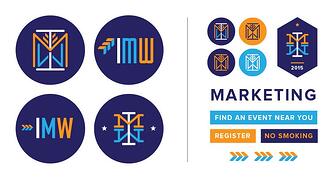
For example, when Tyler designed the logo for Inbound Marketing Week 2015, here are the initial ideas and explorations he presented:

Sometimes, this step is only one little tweak. Other times, it’s a series of longer revisions. Tyler says he usually specifies in the original contract how many revisions he’s willing to do, which forces the client to be more thoughtful about each revision request. “Sometimes, clients ask you to start over from scratch,” he says. “You can avoid this by doing your due diligence when creating the original contract.”
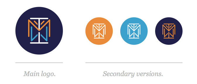
Here is the final revision for Inbound Marketing Week’s logo, along with secondary versions used on the website, lanyards, signs, and other various paraphernalia.

Once the logo’s finished, Tyler will sort out with his client which file formats and other iterations they need that the logo might live on. For example, Icon needed their logo to fit on the bottom of a snowskate. A restaurant might need menus, signage, and t-shirts designed.
Designing a logo from scratch is a difficult creative process that takes a lot of research, knowledge of a business and its audience, and a deep consideration for the principles of logo design. But if you partner with the right designers and have a solid process in place, you should end up with something your company loves (and people can understand).